Samples
Two Face
I first took some images of myself, using a black background and some lights, which would bring some shade onto my face. My idea from the start was to do something evil that looked scary or something that would represent a villain. As i had watched the 2008 movie "The Dark Knight" the day before at home, i thought of doing something similar to Two Face/ Harvey Dent. The obvious choice would have been to use the superhero character which was Batman, but i was drawn to the villains because i felt they gave me more scope.
I first took some images of myself, using a black background and some lights, which would bring some shade onto my face. My idea from the start was to do something evil that looked scary or something that would represent a villain. As i had watched the 2008 movie "The Dark Knight" the day before at home, i thought of doing something similar to Two Face/ Harvey Dent. The obvious choice would have been to use the superhero character which was Batman, but i was drawn to the villains because i felt they gave me more scope.

Using Photoshop i then choose one of the images and started to edit it to make it look something like the image above.
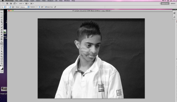
Using the Two Face idea i wanted to create something of my own, so i thought of just creating shapes on the face which would make one side of the image evil. I chose a self portrait because this is the image i know best and also i like the idea of being able to put myself into a film. I decided that i did not want to use colour because it would distract the viewer, especially with colours like red and yellow. I wanted to use black and white because it evokes the past as in old black and white movies, it also creates a darker mood. Originally the image was in colour so I started off by experimenting and adding in a black and white effect, this took out the colour and made the main subject stand out. Using the Burn tool i started to create some dark shades on the face. i experimented a lot on this so that i would get the right type of darkness which would start to create the mood i am looking for. I should also mention the composition, the character is directly in the centre looking out of the frame, this makes the viewer question "What is going on? Where is he looking? What is he looking at?". These are the type of questions i would like the audience to think of when viewing my work. I don't want them to look, i want them to feel!

i then repeated the technique by adding some more shapes which darkened more of the face, this started to improve the depth of the face making it look more 3D. Following this i decided that i should repeat it on the body as well which would create even more evilness.

Using the same Burn tool i darkened one side of the body. This made it look even better as it shows the difference between one side of the body which is evil, whereas the other side is opposite, for example: it is good, pure and also the colour white almost always represents the hero in film.

Using the Burn tool again i darkened the background as well, this highlights the body creating a silhouette. Next i focused back onto the face, i blacked out the eye which made it look evil and haunting, i also went over the hair as well to darken that also.

I then created some lines on the face to give more of an evil look. In order to achieve this i used a small brush and i went around the face creating some lines. This looked as if the character had sustained an injury, or had a tattoo. Also there is definitely a sense of good and evil emerging because of the contrast between black and white.

This is my final still, it shows the difference between good and evil which is what i wanted to achieve. I feel that the most effective part of the image is the desaturation of the jacket, which is in sharp contrast to the background and the other side of the jacket. i decided to put it in frames which shows how each stage was created, this gives an impression of movement similar to stop frame animation.

My final animation based on an Iconic image from "The Dark Knight".
The Joker
I then repeated the same technique using the same image, but this time I chose the "Joker" character from the 2008 film "The Dark Knight". I chose the Joker because I found him compelling on screen. I liked the colours of his costume as they are not bright but more deathly, especially the colour purple which is often associated with funerals and death.
I then repeated the same technique using the same image, but this time I chose the "Joker" character from the 2008 film "The Dark Knight". I chose the Joker because I found him compelling on screen. I liked the colours of his costume as they are not bright but more deathly, especially the colour purple which is often associated with funerals and death.


I then created another one, This time i focused on the Joker from batman.
Image stills journey
i followed harry first with a camera to get a rout planned out. Then using the camera on sports mode i took continuos shots of harry walking down the stairs and then back up. Then using imovie i imported the images in and then used hue and saturation to make the images black and white. i then made the time in between the images quicker to 0.2 seconds. this then made the images look more like a quick journey.
My walking man is of my walking in image stills Harry took my continuos images and i then edited them in photoshop. I took out the background in my image stills. i did this for 7 images. i then put this into director, into each key frame. i then created a loop and moved it across on the timeline. I then added in some speech marks and other images such as a plane and a boat which would move across the other way.
I created this cut out animation with harry. first me and harry cut out letters and some objects out of a magazine. we then thought of what we could do, we wanted to keep it simple so we decided to have something like two cars crashing, and having our names at the end. We then got the camera and put it on a tripod and then started to take images. once our images for taken we then put this in imovie and then changed the time in between to 0.2 seconds. once this was done i then uploaded it onto youtube.
